Building a Dashboard
If you and your group have any questions or get stuck as you work through this in-class exercise, please ask the instructor for assistance. Enjoy! For this exercise, we are going to build a dashboard using the different visualizations created in Activity 2.
Part 1
- Building a data dashboard
- Click the Dashboard icon
 on the bottom toolbar to open a dashboard worksheet.
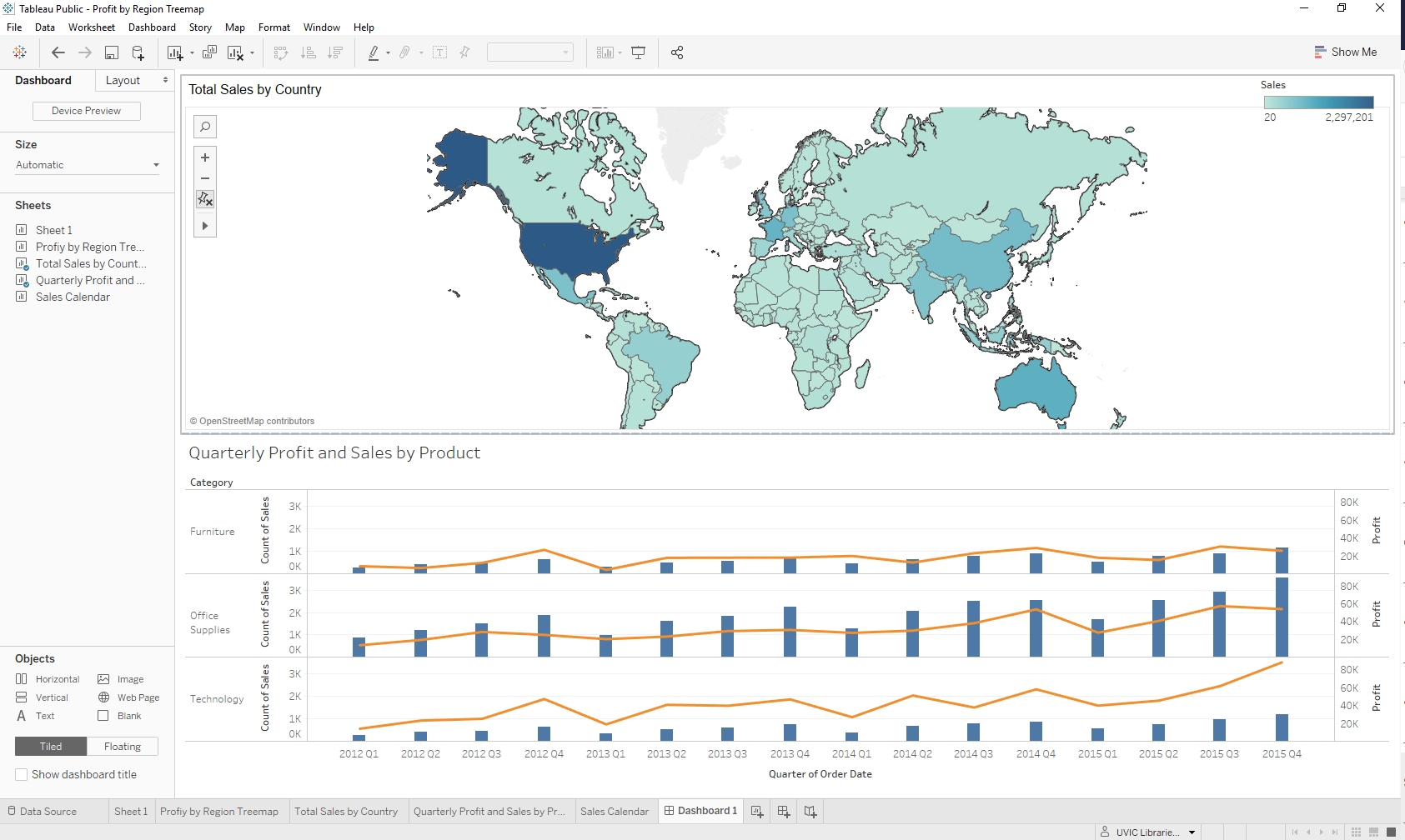
 - On the left side toolbar, under the Size heading, click the drop-down arrow to the right of Range and select Automatic. This will adjust to the size of your dashboard to fit the size of any screen it is displayed on
- The various sheets you have created in Activity 2 will all be displayed on the left side toolbar, under the Sheets heading
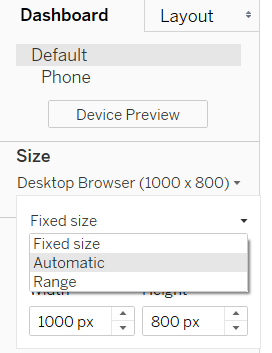
- Drag and drop the map visualization anywhere on the dashboard.
- Drag and drop the bar chart and line graph visualization onto the bottom half of the dashboard. Both visualizations should now be displayed top to bottom.
- Click the Dashboard icon

![]()
- Creating a visualization filter
- Click the white space on the top of the map visualization. Icons should appear on the rop right corner. Select the filter icon to enable the map to operate as a filter
- Click on any of the countries on the map to automatically adjust the sales and profit data to reflect the selected country on the figure below

- Saving your figures and dashboard to Tableau public
- Click File > Save to Tableau Public As…
- Sign in to the login screen that appears. To save the visualizations online, you must create an account
- Saving your figures and dashboard in Tableau Desktop
- Click File > Save as and save to the desired location
Your final output should look like this:
Part 2
This part will cover the creation of an interactive dashboard based on the previously created graphs
- Click the Dashboard icon on the bottom toolbar to open a dashboard worksheet
- On the left side under Size, click on the drop-down arrow to the right of Range and select Automatic. This will allow you to have a full-screen dashboard
- Also on the left side, you should see your graphs: Profit by Year, Order by Person, and Date/Category/Profit
- Click on Date/Category/Profit and drag it onto the dashboard. It will take the full space of the dashboard
- Click on Profit by Year and drag it onto the lower half of the dashboard. Tableau will allow you to put them anywhere and will adjust sizes automatically. So far your dashboard should look like this:
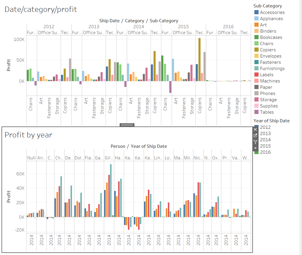
- Click on Orders by Person and drag it onto the lower right side of the dashboard. To make it look more presentable, manually resize it so it is not taking too much space. Play around with placements of graphs, the goal is to present something that tells a story
![]()
- Now comes the most important part. One of the best-known features of Tableau is the ability to interact with data on the go. Click on your Orders by Person graph on the dashboard and you should see a little menu pop up on the side (could be on the right or left depending on the placement of the graph). Click on the Use as Filter option
- Now click on any name on the list to see the graphs change. This particular graph tells a story of a salesperson, their profits by year, and a breakdown of the categories of goods that they sold. Your dashboard should now look like this:
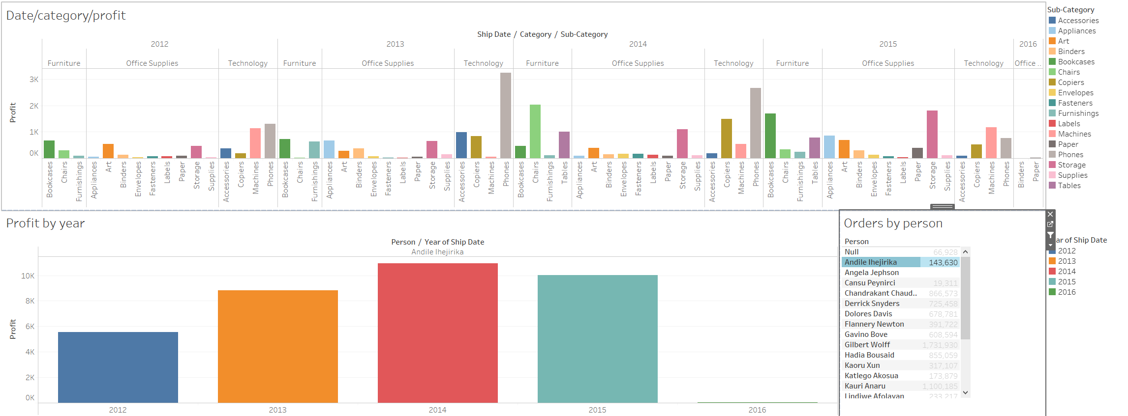

- Note that you can make any of the graphs on the dashboard your filtered item to tell a different story. If you click on the Date/category/profit graph, click on the filter icon, and then select Bookcases in the Furniture section (click directly on the line on the graph), it will display how many chairs were sold in a year by a particular person. Feel free to play around with these filters to see if you can come up with a different interpretation!
