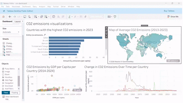
Create a dashboard
Now we are going to create a dashboard with the visualizations we just created. If your visualizations are different from the suggested solutions, the dashboard will look different, but that is totally fine! Feel free to edit and make your dashboard look the way you think it’s best.
Here are some general steps to create your dashboard, with some examples from the suggested visualizations:
-
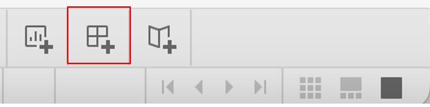
At the bottom of the window, click the icon with 4 squares to create a new dashboard.
-
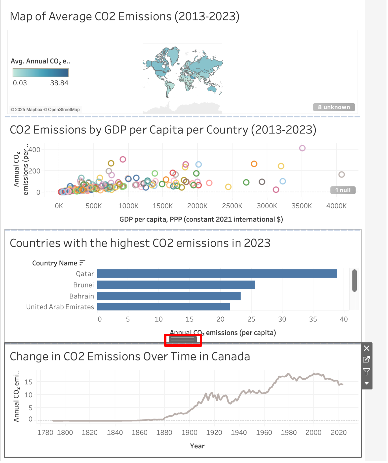
Drag two or more of the sheets you previously created from the Sheets field to the dashboard. When you drag the sheets over, you can arrange where you want them to show up.

-
Once you’ve dragged sheets onto the dashboard, you can move them around by clicking on them, then clicking and dragging the tab that shows up above them. To change the size, hover over the sides to drag them.
-
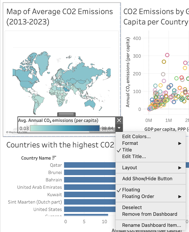
Select map legends to edit or remove them. You can remove them by clicking on the x button that shows up, or edit them by clicking the downward arrow. After clicking the downward arrow, clicking Floating to be able to superimpose it above other sheets. You can also then move the legend around or change its size after selecting the legend.
-
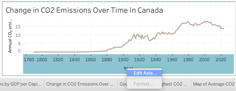
You can also edit axes on the dashboard by right-clicking on them and selecting Edit axis.
-
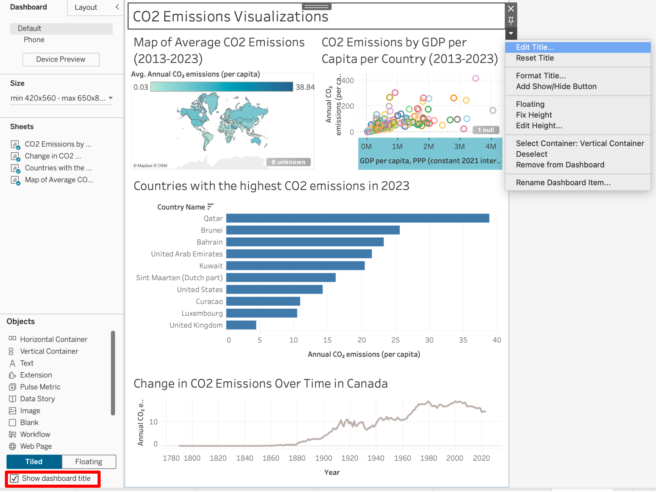
Add a title to your dashboard by clicking the checkbox beside Show dashboard title on the bottom left of the window. Double-click on the title to rename it to CO2 Emissions Visualizations. Format the title by clicking on it, selecting the arrow beside it, and clicking Edit Title.
-
If you want, add dynamic filtering to your dashboard. Click on the visualization you want to use as a filter, and then click on the filter button on the top right. After that, when you select dimensions (e.g. countrie) in that visualization, Tableau will automatically filter all other visualizations for that dimension.
There are many other things that you can do with a Dashboard in Tableau. If you want to know more about them, check out this link.