Creating visualizations
Now that you have connected to your data sources, we are going to build different visualizations that will later be put together into a single dashboard.
For each visualization, start by creating the chart or plot on your own using the skills you learned in the first part of the workshop. Once you have given it a try, you are welcome to review our sample approach below. Remember: there is rarely a single “correct” way to visualize data. Different choices can highlight different insights, and your version is not wrong just because it looks different from the provided solution. As you compare your visualization with ours, consider questions like:
- What advantages does your version have?
- What strengths does the provided example bring?
- What trade-offs exist between the two approaches?
Use this comparison as an opportunity to deepen your understanding and refine your visualization skills.
Create a line graph
Create a line chart that shows changes in CO2 emissions over time for the different countries included in the dataset.
View suggested solution
1. Click Sheet 1 on the bottom left of the window to start creating a graph. Under the CO2 emissions table heading on the left pane, click and drag the Year field to the Columns bar at the top of the sheet, then click and drag the Annual CO2 emissions (per capita) field to the Rows bar.
2. Click and drag either the Entity field or the Country Name (under the GDP per capita table) field to the Marks shelf. There, click the icon beside Country Name and select Color. You have now created a line graph showing changes in CO2 emissions over time for all countries. Clicking on a country in the legend will isolate its corresponding line on the map.

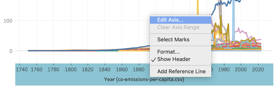
3. Rename the X-axis by right-clicking on it and selecting Edit axis. Rename the X-axis to Year.
4. Rename the graph by double-clicking the title. You can rename it to Change in CO2 Emissions Over Time per Country. You can also enter this title into the sheet tab by right-clicking on it.
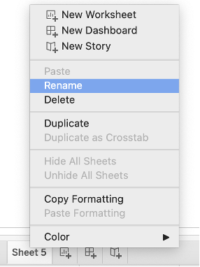
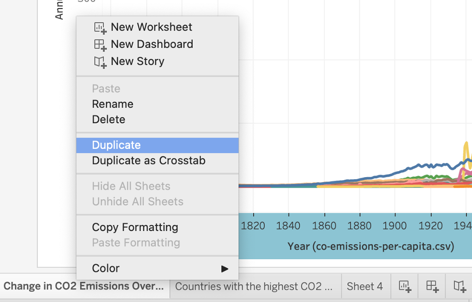
Since a graph showing all countries may be overwhelming, now try to create a separate graph to isolate one or more select countries (you choose which countries you want to show). For that, you can start a new sheet by clicking on the New Sheet button, or you can duplicate your sheet by right-clicking the current tab at the bottom, then selecting Duplicate.
Hint: Use the filter option to select only a few countries.
View suggested solution
1. In your new duplicated sheet, drag either the Country Name field to the Filters shelf, then select the country or countries you would like to display (you may need to click None below the country list to unselect all first). Click OK. Rename your new graph accordingly.
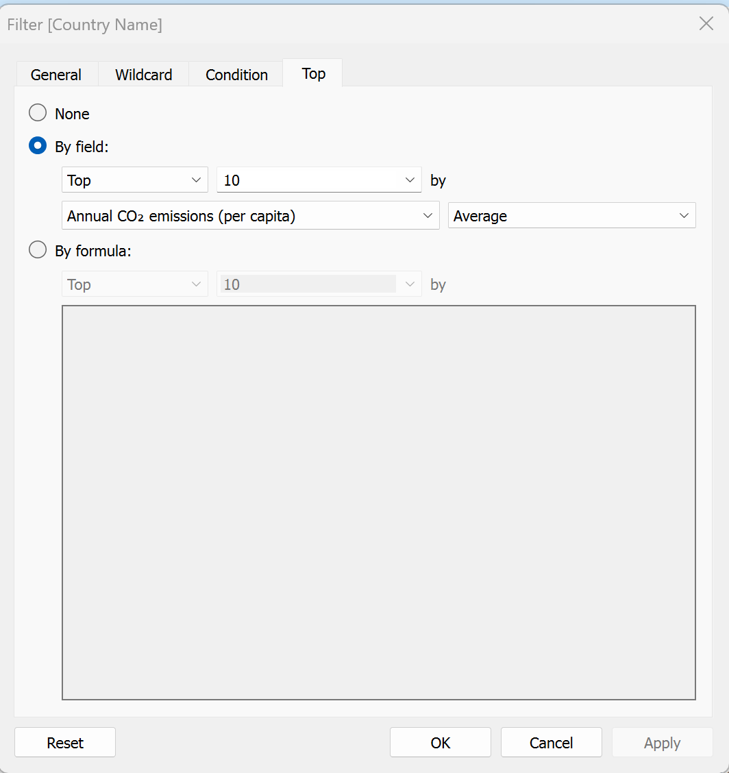
2. Alternatively, you click on the Top tab in the filter option (if you want to go back to it, right-click on Country Name under Filters and click on Edit filter), and choose the top 10 (or 20) countries with the highest average annual C02 emissions.