Create a world map
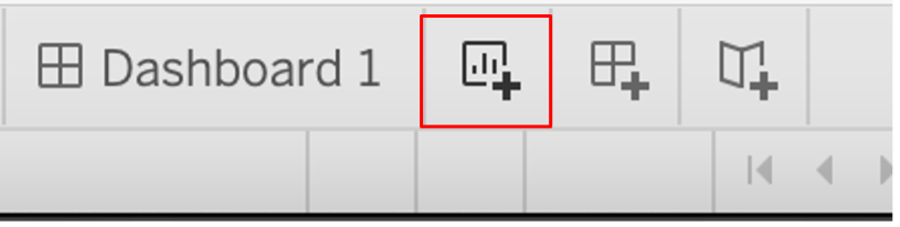
Start a new sheet by clicking the icon to the right of the sheet you created.
Now, create a world map showing the average annual CO2 emissions for all countries over the past decade (or the most recent decade with data).
Hint: to make sure Tableau understand that the country names are geographic entities to be placed on a map, first hover over the Country Name field and click the arrow beside it. Select Geographic Role in the dropdown, then select Country/region.
View suggested solution
1. Drag the Country Name field into the Marks shelf. If a map doesn’t show up automatically, in the Marks shelf toggle and change Automatic to Map.
2. Drag the Year field to the Filters shelf, then enter 2013 to 2023 under the Range of Values tab.

3. Drag the Annual CO2 emission (per capita) field to the Marks shelf. Hover over it in the Marks shelf, click the arrow, hover over Measure, then select Average. This will generate average CO2 emissions for the specified year range. Click the icon beside the field and select Color. If you want to edit the colours, hover over the title of the legend on the right side of the window, and click Edit colors in the dropdown.

4. Name the map "Map of Average CO2 Emissions (2013-2023)".