![]()
Pivot Tables & Charts for Google Sheets
Pivot Tables are a powerful tool that can help you quickly summarize your data. If you have any questions or get stuck as you work through this in-class exercise, please ask the instructor for assistance.
-
Download this spreadsheet with data for this exercise Note: You may have a yellow bar at the top with a button that says Enable Editing. Click on that to enable editing.
-
Create a default pivot table in the spreadsheet you just downloaded:
- Select all the data in the spreadsheet from A1 to C34.
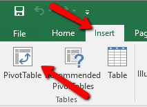
- Select the Insert tab, and then press the PivotTable button on the top left of the ribbon.
- When the PivotTable dialogue box appears, press OK.

- You now have a blank canvas of a pivot table setup. Let’s add data:
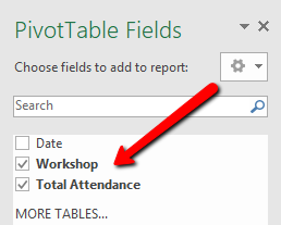
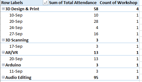
- Select the Workshop and Total Attendance checkboxes on the right hand PivotTable Fields toolbar. You now have a list of workshops with a sum of total attendance for each workshop sorted by the workshop name.
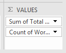
- Let’s add a column to count the number of each type of workshop held: In the PivotTable Field Name area, grab Workshop, and drag it to the ∑ Values area in the bottom right of the Excel window. You should now have a pivot table with another column named, “Count of Workshop”.
- Lastly, select the Date checkbox in the PivotTable.
- Move Date into Rows field. You should now have a pivot table that looks like this:

- Let’s create a chart:
- Start by un-selecting Date in the PivotTable field name area.
- In the ∑ Values area, right mouse click on Count of Workshop and select Remove Field.
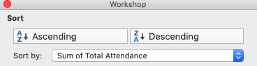
- Sort the Sum of Total Attendance column by clicking on the little arrow facing down (found within the “row labels” cell). Then select “Descending” and sort by the “sum of Total Attendance”. Feel free to try this by selecting “Ascending” instead as well.

- Select the Insert tab on the top ribbon, and then select the PivotChart button in the ribbon.


- Click OK, and now you have a basic chart. Please feel free to experiment with both the data and the chart.

Great job!