Creating a Digital Dashboard
In this activity, you will create a Digital Dashboard, integrating data from a number of sheets and pivot tables. If you have any questions or get stuck as you work through this in-class exercise, please ask the instructor for assistance. Have fun!

-
Download & open this spreadsheet with data for this exercise. Click on the yellow Enable Editing button at the top of the screen.
-
Look at the data in each sheet, by clicking on the tabs at the bottom of the spreadsheet (see below). Note that the “Workshop Most Popular” pivot table sheets summarize the “Workshop Data” sheet.

-
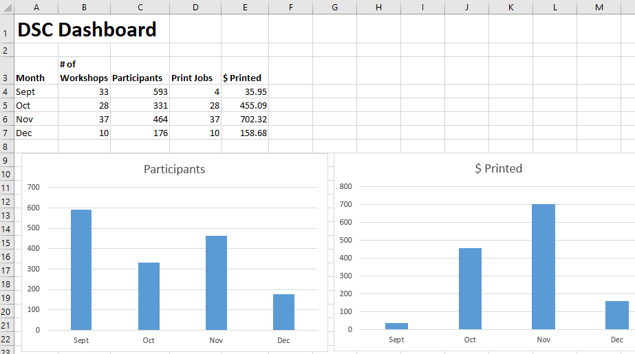
Click on the Dashboard tab at the bottom left of the spreadsheet and give this sheet the title of DSC Dashboard in cell A1.
- Link the Most Important statistics or Key Data to your Dashboard from other sheets:
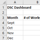
- In A3 type Month. In B3 type # of Workshops. In C3 type Participants. In D3 Print Jobs. In E3 type $ Printed.
- In the rows under month column type: Sept, Oct, Nov, Dec (see right).
- Add the number of workshops from each month to the Dashboard sheet: In cell B4 type: = then click on the Workshop by Month tab, and select cell B5, then press Enter. Do the same for October, November, & December.

- Add the number of participants from each month on the Dashboard sheet: In cell C4 type: = then click on the Workshop by Month tab, and select cell C5, then Enter. Do the same for October, November, & December.

- Add the number of print jobs from each month on the Dashboard: In cell D4 type: = then click on the Print by Month tab, and select cell B4, then press Enter. Do the same for October, November, & December.

- Add the dollar value of print jobs from each month on the Dashboard: In cell E4 type: = then click on the Print by Month tab, and select cell C4, then press Enter. Do the same for October, November, & December.

- Create Visualizations for your most important statistics or key indicators:

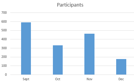
- Create a bar graph of workshop participants by month by selecting A3:A7 and then hold down your ctrl key (or command key on a Mac) and select C3:C7.
- Next, select the Insert tab at the top of the screen, and then click on Recommended Charts. The default bar chart should work fine, so click OK. Click on the Chart Title and rename it to Participants.
- Create a bar graph of $ printed by month by selecting A3:A7 and then hold down your ctrl key (or command key on a mac) and select E3:E7.
- Next, select the Insert tab at the top of the screen, and then click on Recommended Charts. The default bar chart should work fine, so click OK. Click on the Chart Title and rename it to $ Printed

-
Now when you enter additional data into either your Workshop Data or Print Data sheets, your Dashboard sheet summary numbers and charts will update automatically!
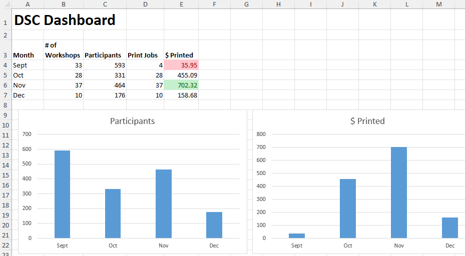
- (Optional): Add Conditional Formatting to highlight key values in your spreadsheet
- Automatically highlight your most important values by selecting E4:E7
- Next, select the Home tab if it’s not already selected, and then click on Conditional Formatting. Within the dropdown menu, click on Highlight Cell Rules, then click on Less than…
- Within the following dialog, type 100 into the left box. Then click OK.
- The value of 35.95 should now be highlighted red.
- While E4:E7 are still selected, click on Conditional Formatting. Within the dropdown menu, click on Highlight Cell Rules, then click on Greater than…
- Within the following dialog, click “Light Red Fill with Dark Red Text” to display other options and click “Green Fill with Dark Green Text.” Then type 500 into the left box. Then click OK.
- The value of 702.32 should now be highlighted green.

 Great job!