Visualize DataFrame
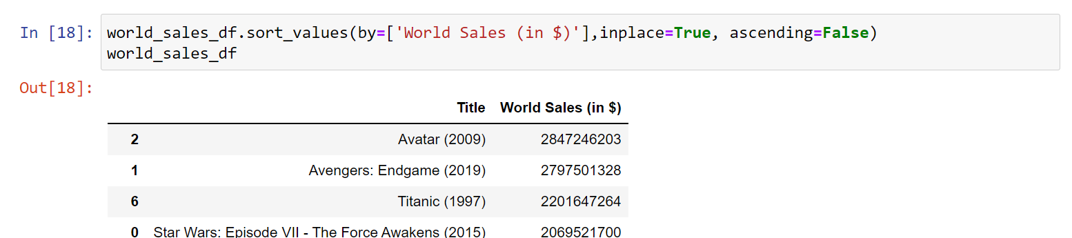
1. Sort your data using df.sort_values().
Choose which column you would like to sort by using the by argument by= ['column name']. The column should be numeric for the following steps. would you like to see the top values or bottom values? Set the ascending argument to either False or True. Again, use inplace=True to replace your existing DataFrame.
Click for code help
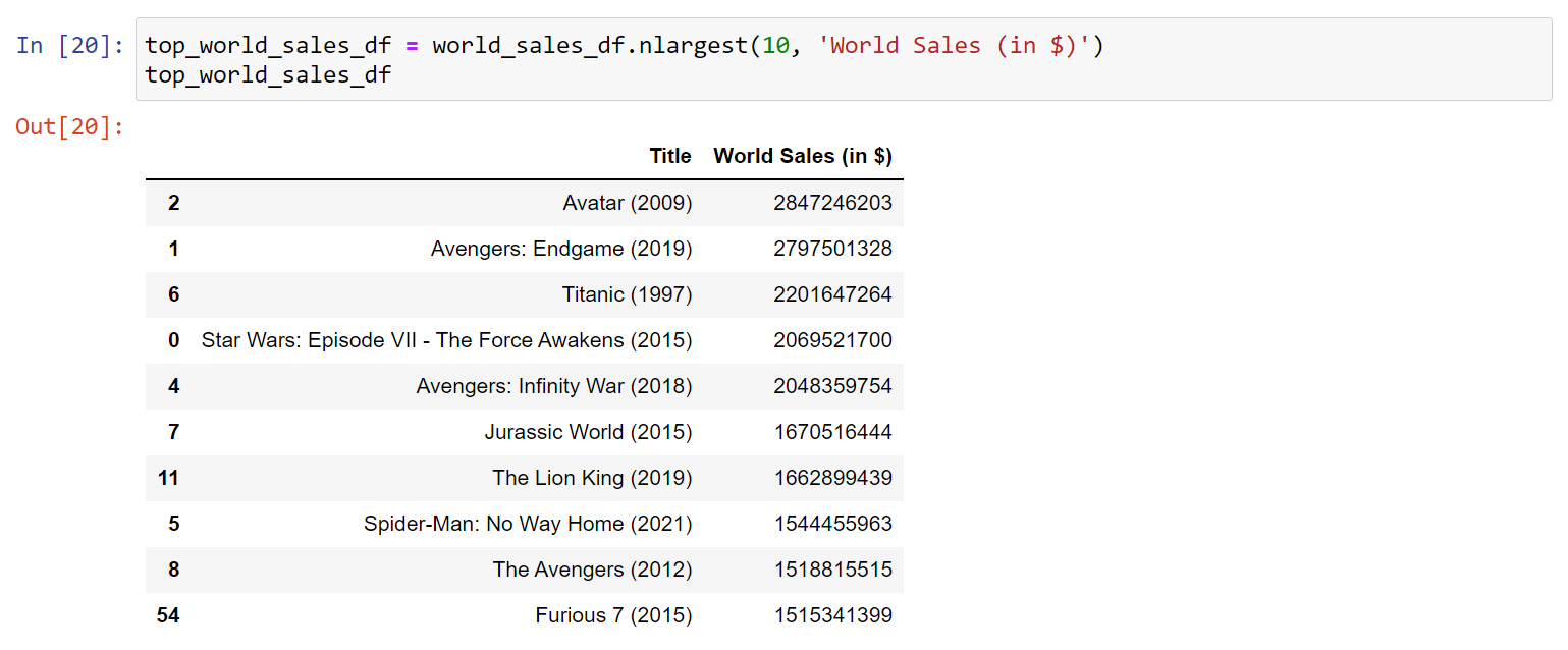
2. To avoid overcrowding your visualization, filter for only the top or bottom of your data (whatever you chose in step 1).
For the top use df.nlargest() For the bottom use df.nsmallest() The first argument is n. How many entries would you like to show in your visualization? The second argument is columns. The column or list of columns to order by. In this case, choose 1 column to order by.
Click for code help
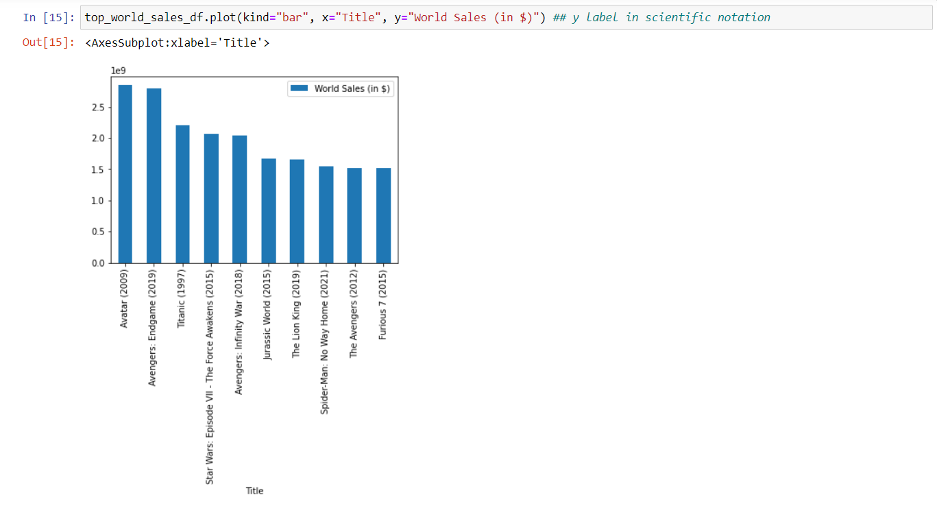
3. Plot your data using df.plot().
Use the kind argument to choose a plot type. This article explains when to choose each kind or plot. Set the x and y values by passing the name of a column to each argument.
Click for code help
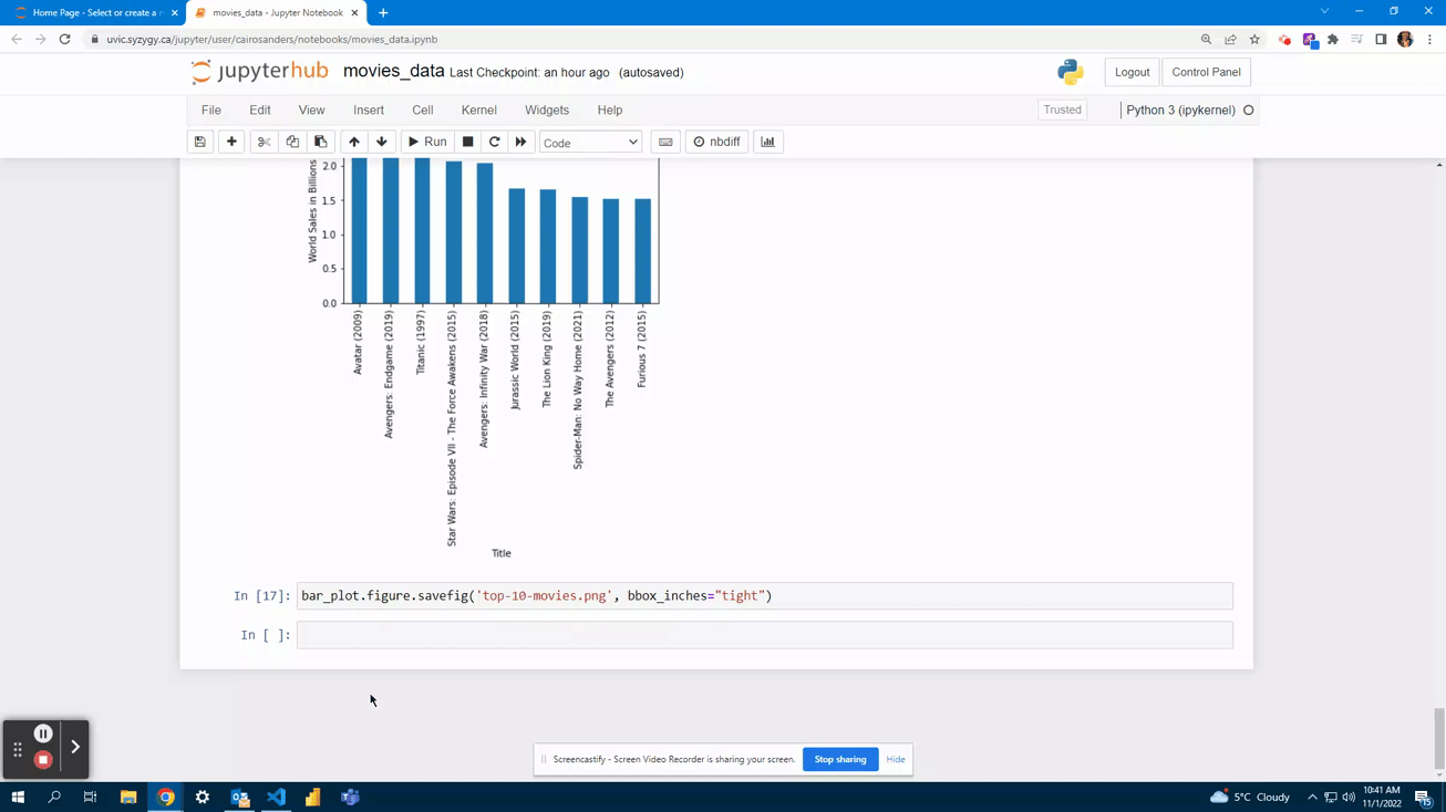
This example uses a bar chart because it is good for illustrating a small number of categorical variables
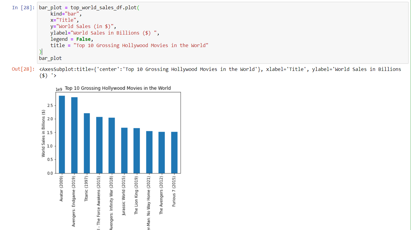
4. Improve your visualization.
Are there any missing labels that could help a viewer understand the chart better? Are there unnecessary chart elements that clutter the visualization? What about a title so the view knows what the data represents? Where you think is appropriate, use the following arguments: xlabel, ylabel, title, legend, grid, figsize see in docs
Click for code help
In this chart, the y-label is in scientific notation, which might not be easy for everyone to read. By adding a descriptive ylabel, it becomes easier to understand that the ticks are in billions.
After adding the y-label, the legend becomes redundant, so it can be removed.
A title is added to explain what the visualization represents.
5. Save the plot to a file using your_plot_name.figure.savefig().
The argument bbox_inches="tight" fits the image size to your plot. Your image will save in JupyterHub
Click for code help

6. Save your new DataFrame as a CSV your_final_dataframe_name.to_csv() and pass a filename you make up as a string for the argument (make sure it ends in “.csv”)
Click for code help

7. (optional) Download the visualization image file so you can share it.
a. Go to the files page by clicking on the JupyterHub Logo
![]()
b. Checkoff the box next to your image file
c. Select Download
Show/Hide Animation
You’re done! You’ve now completed the Pandas DataFrames in Jupyter Notebook Workshop. Thanks for joining us.