Using CSS to Change Layout
If you haven’t already completed the previous exercises, please start on the Getting Started With HTML page, as this part builds on the topics from previous sections.
This section teaches you some CSS basics, so that you can alter the look and function of a basic HTML page.
If you have any questions, or get stuck, please ask the instructor for assistance. Have fun and be patient with yourself because CSS, especially layout, can be tricky!
So far, we have learned to tinker with the following:
- HTML pages
- Headings, text, and lists
- Images
- Links (external, internal, and anchors)
- CSS stylesheets and how to link them to an HTML page
- Some basic CSS styling
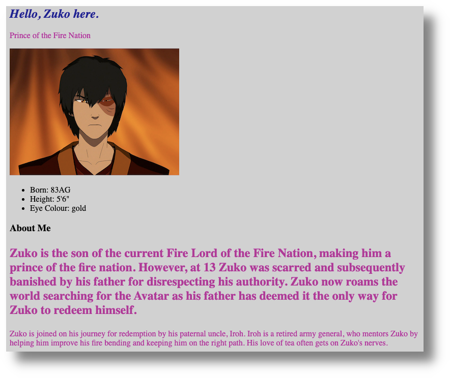
Here is what my about.html page looks like in Chrome, so far:
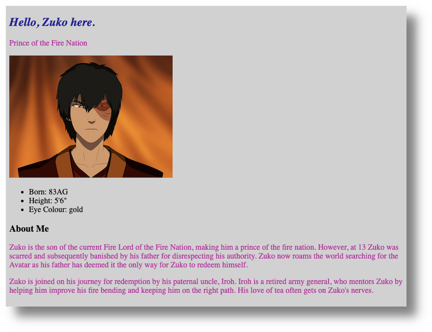
Notice that the content of my about.html page is stacked like a list, from top to bottom. This stacking is the default layout of HTML files, but CSS can change this layout in a number of ways.
But, before we can make any layout changes, let’s take a look at CSS “classes”.
CSS classes
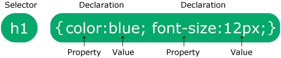
- Earlier, we had looked at CSS “selectors,” such as the
h1in the example, below:
- Classes are another type of selector you can use to define specific rules for specific HTML tags.
- This workshop is all about learning by doing, so we’ll dive into an example to see how CSS classes work.
- In my
about.htmlpage, for example, I have two paragraphs, that is, text content between two sets of open and closedptags. - Let’s say that I want the text to look bigger in the first paragraph, but not in the second. If I use a
ptag as the selector, then whatever CSS styles I apply would change the content to look the same in both paragraphs. We can use custom class to make these paragraphs look different from each other. - To make my paragraph style changes, I will create a CSS “class” in my HTML file and create some CSS rules for it in my CSS file.
Adding a class to the HTML file
- You can follow along with what I do, copy/pasting as you go, or create your own CSS class block, based on what I do in the following steps.
- I have added this class to the first paragraph in my
about.htmlpage:<p class="bigger-text">. - Important: do not put spaces in your class names:
- Incorrect:
<p class="bigger text"> - Correct:
<p class="bigger-text">
- Incorrect:
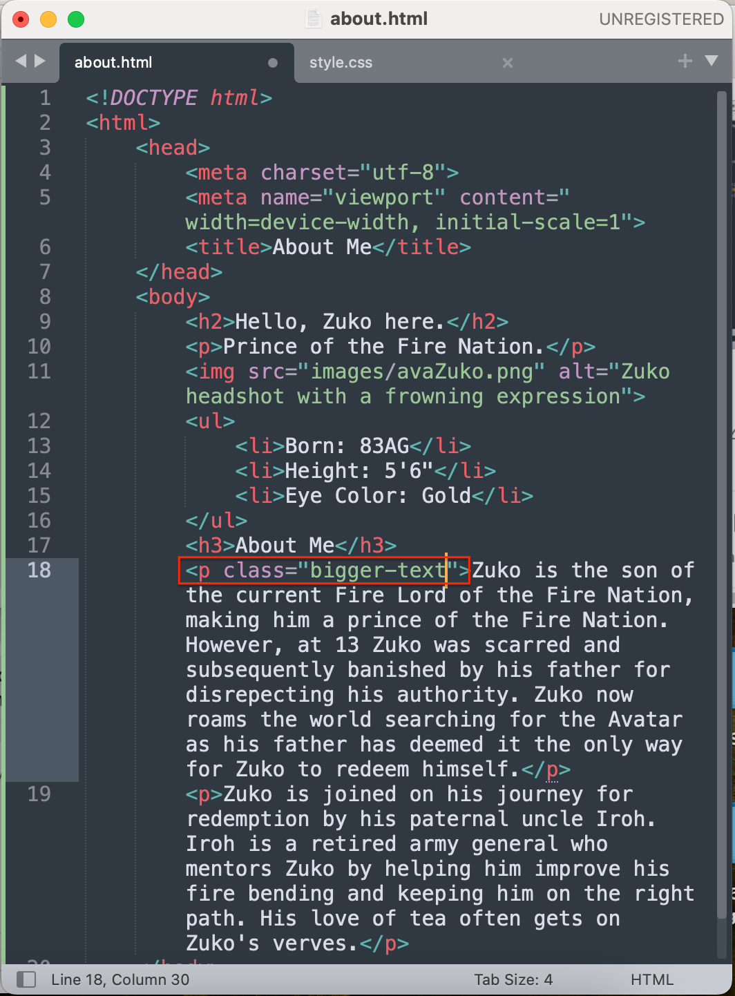
- Here is what my
<p class="bigger-text">class looks like, in context, in myabout.htmlpage:
<p class="bigger-text">Zuko is the son of the current Fire Lord of the Fire Nation,
making him a prince of the fire nation. However, at 13 Zuko was >scarred and subsequently
banished by his father for disrespecting his authority. Zuko now roams the world searching for
the Avatar as his father has >deemed it the only way for Zuko to redeem himself.</p>

<p>Zuko is joined on his journey for redemption by his paternal uncle, Iroh. Iroh is a
retired  army general, who mentors Zuko by helping him improve his fire bending and keeping
him on the right path. His love of tea often gets on Zuko's nerves.</p>
Here is what my <p class="bigger-text"> class looks like in my about.html page, in Sublime:
- I could create a separate class for the second paragraph, but I am happy with its font size already, so I am only creating a class for the content I want to change.
Adding a class to the CSS file
- Now that I have added my
<p class="bigger-text">class to myabout.htmlfile, it’s time to write a corresponding CSS class block in my CSS file. - My CSS class will get its own code block and properties and values.
- Important: in CSS, all class blocks are preceded by a period.
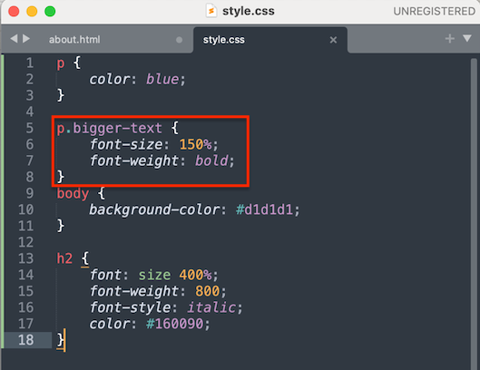
- Here is what the class looks like in my CSS file:
.bigger-text. - Remember, though, that we want to apply our changes to a paragraph
<p>, but with the addition of the.bigger-textclass. So, what we end up with is a combination of two selectors:p.bigger-text. - Here is what my class block looks like in context, and with some properties (
font-sizeandfont-weight) and values (150%andbold):
p.bigger-text {
	font-size:150%;
	font-weight: bold;
	}
Here is what my class block looks like in my style.css file, in Sublime:
- Finally, here is what the
about.htmlpage now looks like in my browser:
- You may have noticed that all the text in both paragraphs is still pink in colour. This is because the
pselector (in the class block above myp.classclass) still determines the colour value for allpselectors. Put another way, thephas precedence overp.class. Another way to think about this is that myp.classinherits the values of thepselector because thepselector is higher up in the CSS hierarchy.- Note that CSS hierarchy, or “style order,” is very complicated, but the curious can consult this handy chart to see how it all fits together.
- However, I can override this precedence order by adding a declaration (a tech-language definition for the combination of a CSS property and its value) within my
p.class. In the following example I have declared a colour for the text by addingcolor: #ffffff;:
p.bigger-text {
	font-size:150%;
	font-weight: bold;
        color: #ffffff;
	}
- Here is what this font colour change looks like in my browser:
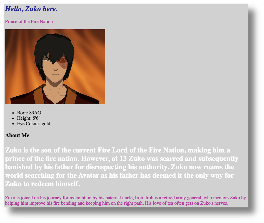
- As far my browser is concerned,
pandp.bigger-textare different classes, with different CSS rules, even though they both havepselectors.
We have just practiced one way to make a class, by combining it with an existing selector. We can also create an entirely unique class that has no relationship to common selectors, such paragraphs, headings, and lists.
Next, I will create a division, or “div”, of content in our about.html file and then use a CSS class to assign it some declarations.
Divisions, or <div> tags
- As with the above section, feel free to copy/paste what I have done or create your own content.
- A
divtag, in HTML, is comprised of an open and closed tag:<div></div>. - Divs define sections within our code. Think of them as content organizers.
- Applying a class to
divtag changes everything within its open and closed<div></div>tags. - In my
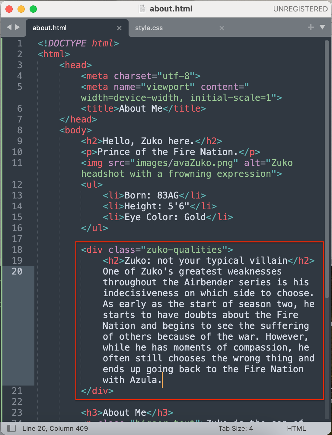
about.html' file, I have added thisdivclass to some text:<div class="zuko-qualities"></div>` - Here is the entire
div, including its content:
<div class="zuko-qualities">
	<h2>Zuko: not your typical villain</h2>
	One of Zuko's greatest weaknesses throughout the Airbender series is his indecisiveness on which side to choose.
	As early as the start of season two, he starts to have doubts about the Fire Nation and begins to see the suffering
	of others because of the war. However, while he has moments of compassion, he often still chooses the wrong thing
	and ends up going back to the Fire Nation with Azula.
</div>
- Here is what my my new
divlooks like in myabout.htmlfile, in Sublime:
- Now it’s time to add some CSS rules to my
<div class="zuko-qualities">in mystyle.cssfile. - Note that I have added CSS comments, which look like this:
/* your comment content goes here */. - Comments are not displayed in browsers. Think of them as explanatory notes for what your CSS rules are doing.
- For the curious, you can read more about comments, and when to use them, on the W3Schools CSS Comments page (↪).
- I will add some font styles and play with the position of my new
div, just to see what it looks like. - Feel free to copy/paste the following CSS code block into your
style.cssfile and play around with its various values to see what happens:
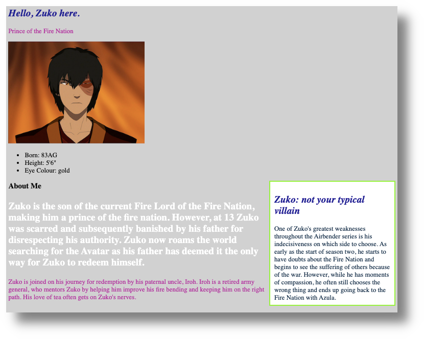
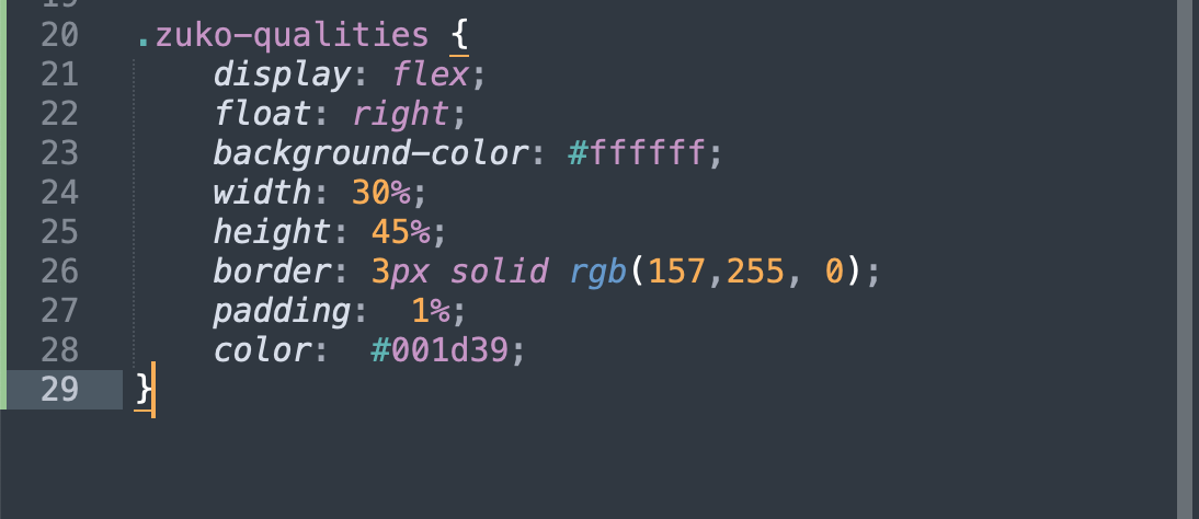
.zuko-qualities {
    float: right; /* "floats <div> "container" to the right of the page */
    background-color: #ffffff; /* changes <div> background colour */
    width: 30%; /* makes the <div> 30% of page width, no matter window size */
    height: 45%; /* makes the <div> 45% of page height, no matter window size */
    border: 3px solid rgb(157, 255, 0); /* adds blue border line around <div> */
    padding: 1%; /* moves the content within the <div> away from the edge on all sides */
    color:#001d39; /* changes <div> text colour */
  }
Make sure to take note of the dot (.) before zuko-qualities to specify the class you want to alter in your CSS file.
- Here is what my
about.htmlpage now looks like in my browser:
- OK: still gloriously ’90s, but now the fun begins again because you can play around with the various values, saving and refreshing your files as you go.
- For example, observe what happens when we change this:
padding: 1%;
… to this:
padding: 20%;
- If you have time, change other values in our new
<div>. - Now you can see how versatile even one
<div>can be! - We have changed the layout of our
<div>in a basic way, but the world of CSS layout can be complex, depending on what you are trying to do. If you plan to learn more CSS, you will eventually have to have a solid grasp of CSS layout, which you can read more about on the W3Schools CSS Layout tutorial page (↪). - One approach to layout is to think of your content—such as paragraphs, images, and
divsections—as tiles or boxes that can be moved around your web page in various ways. - Next, we will play with another way of arranging layout, using flexible boxes, or “flexboxes”.
CSS layout with “flexible boxes,” or “flexboxes”
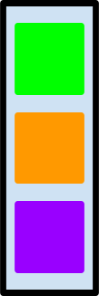
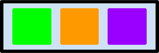
- A flexbox is a CSS layout model used to organize a webpage’s content.
- In the image below, imagine that the coloured squares within the rectangle are separate content containers within a larger container:
- Flexboxes work by separating each element in your HTML page—such as paragraphs, images,
divsections, or any content—into their own containers, or boxes. - The advantage of flexboxes is that they can be be told how to behave and organize themselves, even when viewed with different screen sizes, from desktop computer screens to smartphones.
- We are going to turn our whole
about.htmlpage into a “flex container,” making the elements within it (our divs, paragraph, and images) separate containers, or boxes. - Within your
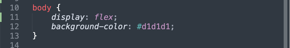
bodyselector, add the followingdisplay: flex; - Here is my example:
	body {
            display: flex;
        }
- Here is what
display: flex;looks like in mystyle.cssfile, in Sublime:
- Here is what it looks like in my browser, after I have saved my CSS file and refreshed my browser:
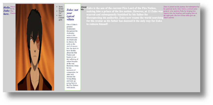
- Wow! Everything looks horizontally arranged in a row, and quite strange. This is to be expected because the default arrangement for
flexis to display objects as a row:
- I don’t want my
about.htmlpage to look like this either, so I will move thedisplay: flex;declaration to my<div class="zuko-qualities">and see what happens. - Here is what the whole
zuko-qualitiesclass block now looks like:
.zuko-qualities {
    display: flex;
    float: right;
    background-color: #ffffff;
    width: 30%;
    height: 45%;
    border: 3px solid rgb(157, 255, 0);
    padding: 1%;
    color:#001d39;
  }
Here is what the zuko-qualities class block looks like in my style.css file, in Sublime:
- Here is what my
about.htmlpage now looks like in my browser:
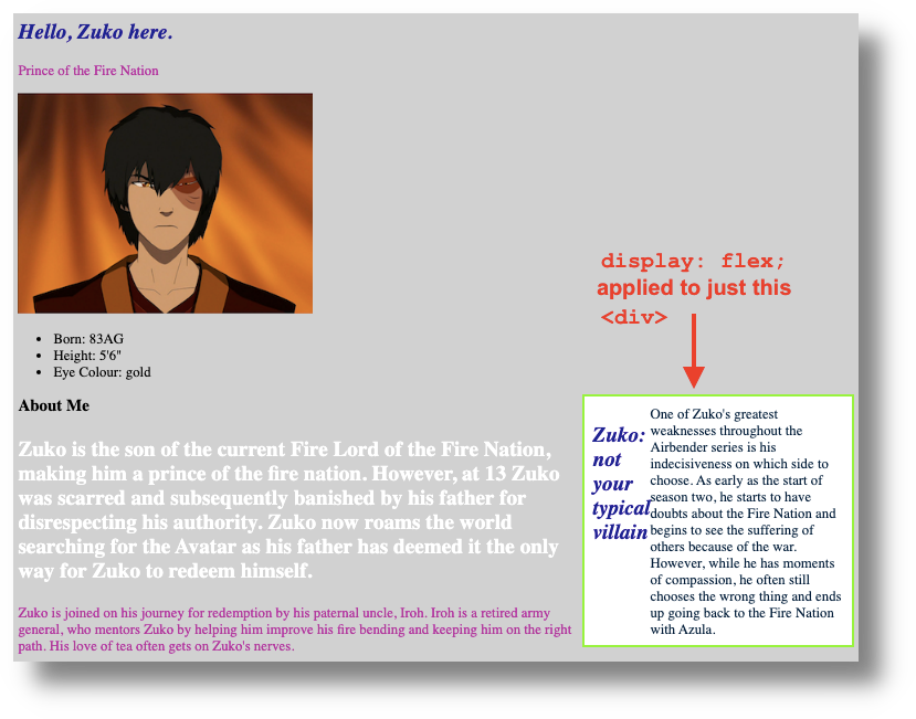
- Notice that, now, only the content within the
<div class="zuko-qualities">is horizontal. The text does not look that great, but the goal with this experiment is to learn what flexboxes can do. - If you had two images, for example, and wanted them to sit side-by-side, you could create a
divin yourabout.htmlfile, and then place image links within thediv. Then, in yourstyle.cssfile, adddisplay:flex;to the CSS declarations for your newdiv. By default, the images would sit horizontally in a row. - Flexboxes can be tricky to understand until you start playing with them. As your web pages become more complicated, generally, the CSS rules for your page will as well.
- If you have the time, you can practice playing with flex boxes by working through the W3Schools CSS Flexbox tutorial (↪).
🎊 Congratulations! You have now completed our Introduction to Coding With HTML & CSS workshop! See the Next Steps page for additional resources and more….